In this post, we will cover on how to implement responsive UI menu and also create a responsive (not a fixed resolution) screen size in unity. The problem we are facing in UI implementation is android or iOS are having wide variety of different screen resolution and screen densities, UI layout need to adopt that different screen resolution. The goal of this post is to adopt one layout to various resolution.
 |
| unity mobile screen resolution |
To create a responsive UI menu, you must understand two things
Anchors is responsible for positioning of UI element and every UI element have its own anchors
 |
| anchors in unity |
Anchors is the feature in unity that helps you to position your UI element with different screen sizes or screen densities, anchors contains four points (as screen contains 4 sides) that are by default connected to the center of parent rectangle. This means that by default your UI element have some constant offset from center of the screen.
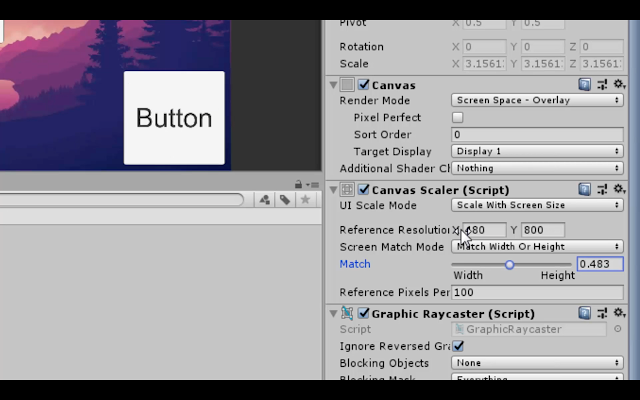
Canvas Scalers is responsible for sizing of UI element and canvas scaler is available in canvas and it is applied for all UI element inside canvas.
 |
| Canvas scaler in unity |
canvas scaler will scale things with screen size, so best thing is to set size of UI elements at lowest resolution (480 x 800) so it will automatically scale the size of UI element (button, textfield) with screen size.
In canvas scalar, there are three attributes you must care about in order to make your UI responsive.
- UI scale mode
- Reference resolution
- Match
In the UI scale mode, change it from constant pixel to scale with size. For reference resolution, add width as 480 px and height as 800 px and also do initial size setting of UI element at this resolution (480 x 800) otherwise it will not work appropriately. The last attribute is match, match is option for screen size scaling dependence with width or height, by default, it is depended on width and it value is from zero to one. When value of match is zero means it is totally depended on width, 0.5 values means depended on both width and height. 1 value means it is depended on height only. So set value of match as 0.5.
Example
 |
| unity ui example 1 |
lets take example of 5 buttons, align the button in such a order that two button appear at top of the screen, one button appear at center of screen and two button at bottom of screen.
if you change the screen resolution to higher, button position and size will be effected and which look very bad. To solve these issues use anchors, set top two button as anchor preset of top right and top left, don't touch the center button it is already anchor to center, set remaining two bottom button anchor preset as bottom right and bottom left.
 |
unity ui example 3
|
After i applied correct anchors to button and change screen resolution, it show appropriate position of buttons but still problem is in size of buttons, to sizing issue i used canvas scaler. First set UI scale mode to scale with screen size and set reference resolution as 480 x 800.
 |
| unity screen resolution in portrait 1 |
 |
| unity screen resolution in portrait 2 |
 |
| unity screen resolution in landscape |
after changing in canvas scaler, when i change to higher resolution in portrait then it look good but when i change to landscape higher resolution, it looks bad. Button become so large that it overlap with each other. To solve this issue, there is match property in canvas scaler. Match property is responsible for screen scale dependence on width or height of screen. By default, it is zero which it is only depended on width, let make the match value to 0.5 to depended on both width and height.
 |
| Responsive UI in unity |
After changing match value to 0.5, it work fine for all the screen resolution.


